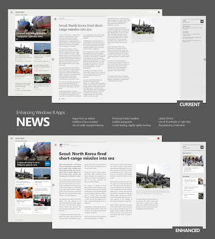
Windows 8 Modern applications are full of potential. Unfortunately, most third party apps (and even first-party apps from Microsoft) sometimes lack the “polish” that would really define the freshness and flexibility of the Modern/Metro user interface.
Take for example the News app by Microsoft. By any measure, it does the job well. It aggregates news from different sources and display them in a landscape format complete with texts, photos and even videos. However, I think it can be enhanced a little bit more for legibility, improved breakdown of information and functionality.
Click the image above to see a larger version or click here to view the image in full resolution.

