I was actually hyped up and expectant to the iOS7 refresh interface after watching this video. I didn’t know I was about to get disappointed with what I was going to see.
Apple clearly left their glossy, skeuomorphic tendencies on iOS6. iOS7 was supposed to be a ‘new, fresh, redesign of iOS since the introduction of the iPhone’ back in 2006. It was supposed to take iOS into the next decade, much like what was touted for OSX Mavericks. Unfortunately it was not all ‘revolutionary’ or even ‘beautiful’ at all on Ive’s watch.
Icons could have obviously been ‘are you blind?’ better

What about the colors? Why are gradients in different shades on some apps like Mail and Safari? The light to dark gradient on Safari is inverted on the Mail app.
Take a look at this concept design by Dribbble user Leo Drapeau. To the right is what Apple’s iOS7 icons looked like when it was shown yesterday at WWDC. The left one (click to enlarge) are Leo’s own quick take on what the icons could have looked liked. I personally think his are A LOT better than what Ive’s team did.
So, I kept the same design direction, the overall look and fresh feel to it, but trying to make it look more detailed, coordinated and just cleaner. Also, I kept the old iOS border radius for the icons (the new standard doesn't feel right to me), and also the old items on the right of the status bar. - Leo Drapeau via Dribbble
Helvetica Neue Ultra Light – Now we made Helvetica even 40% thinner
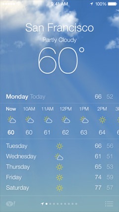
Thin typography screams breathes a feeling of lightness and simplicity. It’s obvious that Jony Ive likes thin stuffs but considering the mix users of iOS, (from iPhones, iPods and iPads) thin fonts, while looking good, present a visual challenge for small bits of information on screen and for the people looking at them, specifically the older demographic.
I personally prefer the way Google Now’s typography is helping break the flow of information into digestible pieces with varying sizes, thickness, and flow (italicized)
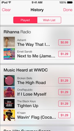
Glass transparencies and neon colors
Microsoft already did away with Windows Vista’s Aero effect on Windows 8. I have no idea why Apple thought blurred transparencies was the way to go for iOS7. Maybe just so they wouldn’t have to say that they went flat because everybody said so.. “Flat? We’ve got transparency and parallax baby”
Control Center (on the left) looks like a mashup of Windows Phone 8 icons and Android’s notification center gone bad. Is the Wifi turned on or off? What is that fat down arrow doing on top? It goes on..
Still in beta technically.
iOS7 is still in beta actually and is currently being seeded to developers. Things might change when it is released this fall but what they presented on WWDC was something that I didn’t expect from Apple. I even laughed at the crazy article that 9to5mac posted before the official announcement because I could not, for the life of me, ever believe that Apple would do something like that.
OF course, I would still need to hold and use the actual OS itself. Will reserve my final judgment till then.


