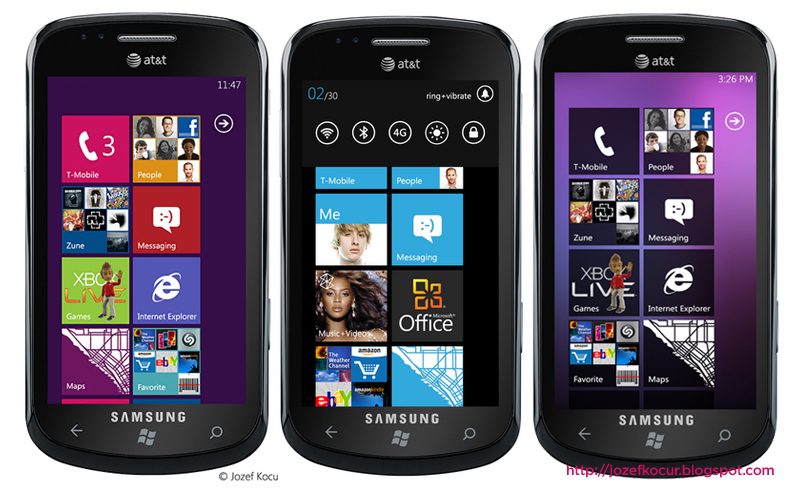
Browsing over XDA, I noticed a link to the J&K Design blog by Jozef Kocur which has lots of graphical interface designs and ideas. I found that his Windows Phone 7 ones were curiously appealing and down-right practical. (click to enlarge the image)
His left-most concept shows what WP7 would look like after the Apollo update, which presumably would merge Windows 8 and Windows Phone. It looks great and now made me wonder why Microsoft never did allow different color tiles such as those seen in Windows 8.
On the middle, you can see his concept of Settings Toggle just below the volume and notification bar. Interchanges with Zune player controls with the volume keys.
I was also thinking about launching the Zune Part by pressing Volume-Up button, and launching Setting Toggles by pressing Volume-Down Button.
The last image also shows a gradient background under the unusually inverted dark tiles. It just goes to show that there is still lots of room for WP7 to showcase Metro UI in its full glory at the same time allowing users to customize their phones more that what is allowed today.
Check out his website for more hi-res images and concepts. Live Thumbnails and daily Bing lock screen wallpapers are just some nifty ideas that Microsoft should really consider making into a reality. Good job Jozef!

